I am Perplexed: Comments on the World Financial Situation and Peak Oil
Posted by Gail the Actuary on June 9, 2010 - 10:15am
Topic: Economics/Finance
Tags: economic crisis, economics, gdp, peak oil [list all tags]
Topic: Economics/Finance
Tags: economic crisis, economics, gdp, peak oil [list all tags]
This is a guest post by Bob Lloyd. Bob is an associate professor of energy studies at Otago University in New Zealand.
I am perplexed; I really cannot understand how the world’s economists and commentators on the present precarious global financial situation have not come to the conclusion that must be obvious to all persons who have followed peak oil. Money is not a disembodied quantity; it is related to the real world by means of what people can exchange it for. In particular the relation between energy and money must be very tight to the extent that money pretty well must be a token for energy and therefore for oil.
Except possibly for bare land, all items of trade, food, minerals, motor cars and other consumer goods rely on energy for their manufacture, and crude oil forms the largest share of the world’s energy mix, followed by coal and gas. Thus, if we plot world energy supply against world GDP, we should get a close relationship. Oil is currently around 35% of world energy supply. Figure 1 below gives a plot of world GDP against world oil supply. The GDP figures come from economist Angus Maddison, but other sources would give similar results.
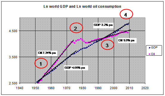
Figure 1: the natural log of world oil supply and the natural log of world GDP plotted against time
I am perplexed; I really cannot understand how the world’s economists and commentators on the present precarious global financial situation have not come to the conclusion that must be obvious to all persons who have followed peak oil. Money is not a disembodied quantity; it is related to the real world by means of what people can exchange it for. In particular the relation between energy and money must be very tight to the extent that money pretty well must be a token for energy and therefore for oil.
Except possibly for bare land, all items of trade, food, minerals, motor cars and other consumer goods rely on energy for their manufacture, and crude oil forms the largest share of the world’s energy mix, followed by coal and gas. Thus, if we plot world energy supply against world GDP, we should get a close relationship. Oil is currently around 35% of world energy supply. Figure 1 below gives a plot of world GDP against world oil supply. The GDP figures come from economist Angus Maddison, but other sources would give similar results.
The oil data comes from BP statistics (from 1967) and Realty earlier. The plots are the natural logarithm of each against time, starting around 1950 to the present. With these plots the slopes of the lines give the percentage increase per annum and these increases are shown on the plots.
There are four regions of interest on the figure, the first region is from 1950 to 1974 and the data for this time shows that the increase in world oil supply was around 7.3% p.a. compared to the increase in world GDP of around 4.6% p.a.. Or in other words, a 1% p.a. increase in oil supply produced a 0.63% p.a. increase in world GDP.
The second region of interest is the period of the 1970s oil crisis when turmoil in the Middle East hiked prices and restricted supply. During this time the world changed the relation between oil and GDP dramatically. Energy efficiency was improved and energy intensity, that is the ratio of energy use to GDP, decreased, such that in the third period, from the mid 1980s until recently, the increase in world GDP to increase in world energy supply reversed and during this time a 1.6% p.a. increase in oil supply was able to produce a 3.2% p.a. increase in GDP. That is the world GDP increased at double the oil supply increase. Now a change in the increase by a factor of two means that if we plot oil use against the square root of the world GDP the slopes should be the same on average. This plot is shown in figure 2.
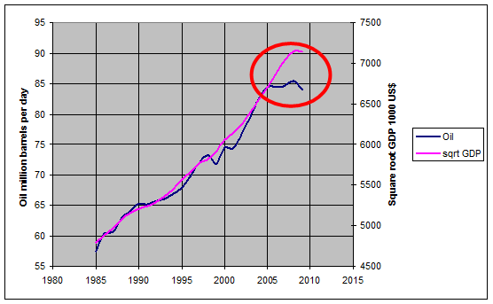
Figure 2: oil production in million barrels per day plotted against the square root of world GDP in constant (US$)
As can be seen, the relationship is very close except after 2005, the fourth region of interest. How can that be? World GDP still increases at 3.2% per annum until 2008, but oil production is pretty much flat. At first sight it looks as if world oil use has been decoupled from the world economy? But, what about world debt? Figure 3 shows two sets of data, one from the CIA World Fact Book (total external debt)and the other from the Economist (Magazine) Intelligence Unit (public debt), see: http://buttonwood.economist.com/content/gdc over the past decade.
Finding any data sets back in time for total external debt has proven difficult, any help would be appreciated. The CIA Fact Book data is pretty erratic in terms of what country data are available before 2005 with only a few countries in a complete set from 2003 to 2009. The data from these countries do, however, suggest debt levels accelerating after 2005: see figure 4. The data set from the Economist, for public debt only, is shown in figure 5.
Data from the International Monetary Fund gives reasonably good data for developing country debt but the data for the wealthy countries does not appear in their databases. Presumably because the wealthy countries were thought to be too big to fail! Of course some countries may have reason to hide their real position as it would be likely to affect their credit ratings and hence their economy (e.g. Greece). But with world GDP hovering around the 60 trillion level as of 2009, it is clear that world external debt is now close to world GDP and that debt will make it difficult to cope with a falling oil supply. Economists of the Keynesian variety, who are still advocating even more debt to stimulate growth, may be in for trouble. In Keynes’s time when there was an increasing supply of oil at 7.34% p.a. this could have worked, but not at the present.
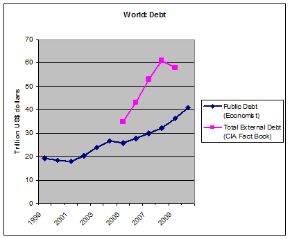
Figure 3: world debt from 1999 to 2010
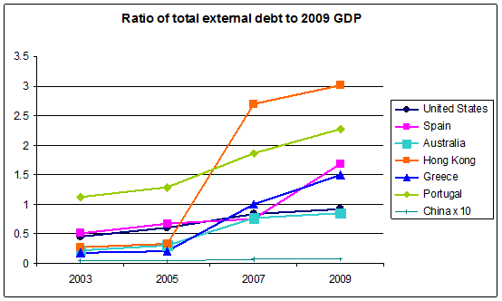
Figure 4: total external debt as a fraction of 2009 GDP for a small selection of counties that the debt data is available for in the CIA fact book database
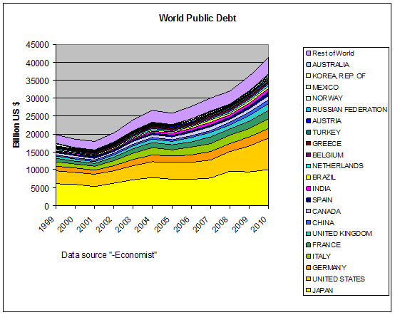
Figure 5: World Public Debt for the most indebted 21 countries, plus the rest of world
The debt information is pretty suggestive of what is going on, and that is, the reason the world has been able to keep increasing GDP since 2005 is because it has been borrowing from the future to fund the addiction to economic growth. But this situation cannot continue without serious problems in terms of repayment. And we have imminent peak oil, with the consensus dawning that soon after 2011 oil supply is highly likely to start declining with decline rates anywhere between 2% and 8% per annum.
The 64 trillion dollar question is what will happen to world GDP? Robert Hirsh in his 2008 Energy Policy paper has suggested that GDP will decline at around the same rate as oil supply, so if oil supply declines at 4% per annum then world GDP will also decline at 4% per annum. If the current ratio is anything to go on, then 4% decline in oil may produce an 8% decline in GDP, but the situation is not likely to be symmetric or for that matter linear. With a large debt hanging around it is also likely that the world monetary system is at risk of imploding (see Gail Tverberg’s recent posts on debt repayments in a situation of decreasing wealth. http://www.theoildrum.com/node/6439).
With peak oil and large world debt coinciding it thus seems as if we are staring down the barrel of a highly non linear event and if you factor in climate change it may be a double barreled, highly non linear, pair of events.
There are four regions of interest on the figure, the first region is from 1950 to 1974 and the data for this time shows that the increase in world oil supply was around 7.3% p.a. compared to the increase in world GDP of around 4.6% p.a.. Or in other words, a 1% p.a. increase in oil supply produced a 0.63% p.a. increase in world GDP.
The second region of interest is the period of the 1970s oil crisis when turmoil in the Middle East hiked prices and restricted supply. During this time the world changed the relation between oil and GDP dramatically. Energy efficiency was improved and energy intensity, that is the ratio of energy use to GDP, decreased, such that in the third period, from the mid 1980s until recently, the increase in world GDP to increase in world energy supply reversed and during this time a 1.6% p.a. increase in oil supply was able to produce a 3.2% p.a. increase in GDP. That is the world GDP increased at double the oil supply increase. Now a change in the increase by a factor of two means that if we plot oil use against the square root of the world GDP the slopes should be the same on average. This plot is shown in figure 2.
As can be seen, the relationship is very close except after 2005, the fourth region of interest. How can that be? World GDP still increases at 3.2% per annum until 2008, but oil production is pretty much flat. At first sight it looks as if world oil use has been decoupled from the world economy? But, what about world debt? Figure 3 shows two sets of data, one from the CIA World Fact Book (total external debt)and the other from the Economist (Magazine) Intelligence Unit (public debt), see: http://buttonwood.economist.com/content/gdc over the past decade.
Finding any data sets back in time for total external debt has proven difficult, any help would be appreciated. The CIA Fact Book data is pretty erratic in terms of what country data are available before 2005 with only a few countries in a complete set from 2003 to 2009. The data from these countries do, however, suggest debt levels accelerating after 2005: see figure 4. The data set from the Economist, for public debt only, is shown in figure 5.
Data from the International Monetary Fund gives reasonably good data for developing country debt but the data for the wealthy countries does not appear in their databases. Presumably because the wealthy countries were thought to be too big to fail! Of course some countries may have reason to hide their real position as it would be likely to affect their credit ratings and hence their economy (e.g. Greece). But with world GDP hovering around the 60 trillion level as of 2009, it is clear that world external debt is now close to world GDP and that debt will make it difficult to cope with a falling oil supply. Economists of the Keynesian variety, who are still advocating even more debt to stimulate growth, may be in for trouble. In Keynes’s time when there was an increasing supply of oil at 7.34% p.a. this could have worked, but not at the present.
The debt information is pretty suggestive of what is going on, and that is, the reason the world has been able to keep increasing GDP since 2005 is because it has been borrowing from the future to fund the addiction to economic growth. But this situation cannot continue without serious problems in terms of repayment. And we have imminent peak oil, with the consensus dawning that soon after 2011 oil supply is highly likely to start declining with decline rates anywhere between 2% and 8% per annum.
The 64 trillion dollar question is what will happen to world GDP? Robert Hirsh in his 2008 Energy Policy paper has suggested that GDP will decline at around the same rate as oil supply, so if oil supply declines at 4% per annum then world GDP will also decline at 4% per annum. If the current ratio is anything to go on, then 4% decline in oil may produce an 8% decline in GDP, but the situation is not likely to be symmetric or for that matter linear. With a large debt hanging around it is also likely that the world monetary system is at risk of imploding (see Gail Tverberg’s recent posts on debt repayments in a situation of decreasing wealth. http://www.theoildrum.com/node/6439).
With peak oil and large world debt coinciding it thus seems as if we are staring down the barrel of a highly non linear event and if you factor in climate change it may be a double barreled, highly non linear, pair of events.
No comments:
Post a Comment